Brand New Marketing Images & Concepts for Black Ops 2
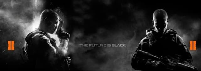
[nggallery id=291]
Petrol Advertising, the masterminds behind Black Ops 2’s marketing, recently updated their web site with never before seen marketing material and images for Black Ops 2.
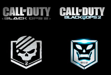
Black Ops II Logo:
Evolving BLACK OPS into a franchise in its own right was PETROL’s challenge in 2012. With the upgraded original font design for the subtitle BLACK OPS, we subtly suggested the sequel to have a more modern setting, while the addition of the orange “II” gives a signature color to the franchise and an iconic mark for further viral and advertising use.
Packaging:
To distinguish BLACK OPS 2 from its predecessor, PETROL seized the opportunity to brand “II” in two different ways: first, as two ambient beams of light and more prominently as an iconic orange symbol that will live on all the game’s promotional materials. The game’s hero is depicted with his eyes closed and taking a deep breath before he strikes: another step to market the emotion, not the gameplay.
E3 Booth:
Working closely with Activision, Treyarch, and the booth vendor, PETROL designed an epic presence at E3 for BLACK OPS 2.
MERCHANDISING:
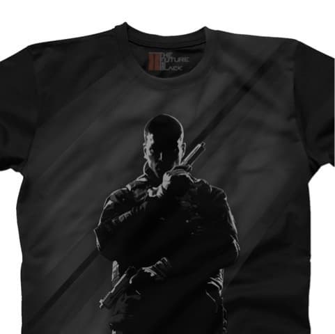
Activision approached PETROL to develop a library of assets to license out to retailers (Target, Wal Mart, etc.) to create merchandise for MW3. The challenge was to create unique, premium-feeling visuals specifically for merchandise to avoid an over-saturation of box art and logo imagery.
INTERNATIONAL RENDER (Poster):
With “Lone Wolf” key art established PETROL was tasked with marketing the established key art to fit the needs of other territories that didn’t hone in on the Black and White design being used in America. For Black Ops 2, PETROL developed a series of unique renders for use in international territories.
Gamestop Poster:
Teasing a teaser is just the beginning of a global launch. PETROL’s work on the save the date approach helped drive consumers back to pre-order “the future.”
SOURCE: Petrol Advertising
